deviant art

Deviant Login Shop  Join deviantART for FREE Take the Tour
[x]
Download Image
PNG, 1487×600
more ▶

More from ~Raven30412

Featured in Groups:

Details

November 18, 2008
103 KB
1487×600
Link
Thumb

Statistics

Comments: 25
Favourites: 67 [who?]

Views: 11,086 (0 today)
Downloads: 408 (0 today)
[x]
:iconraven30412:
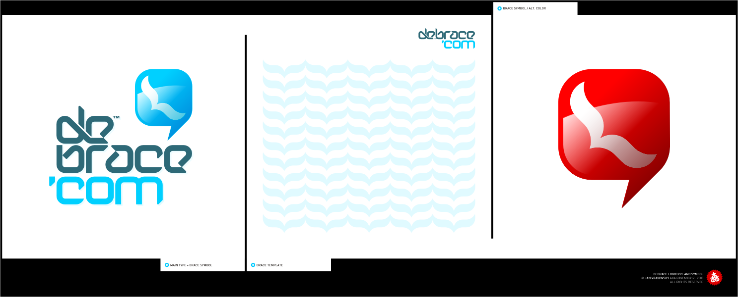
logotype (typography), symbol and universal template (for letters, package designs, website backgrounds etc.) created for Debrace, US based company producing, selling and importing design products.

Main mottos were "Design", "Freedom", "Easy" and "Green".

work on this project was stopped at the moment because client didn't like the results, saying it's not "design-intensive enough", and started searching for someone else to do the job... in 5 days (including today).

well, good luck to them!

comments are welcome, and sorry for the shiny layout, I felt I want to do something like that for change...
Add a Comment:
 
love 0 0 joy 0 0 wow 1 1 mad 0 0 sad 0 0 fear 0 0 neutral 0 0
:iconcoreper:
Mood: Wow! ~coreper Sep 14, 2010  Hobbyist Interface Designer
aaaaaaah, i looooove that typography!!!!
Reply
:iconmelongray:
it would be nice without glossy thing on th logo. btw, i like the font
Reply
:iconraven30412:
i like it with the glossy thing about the same as without it... sometimes i get bit bored with the minimalistic style and need to do something like this.

thank you, it's not font though.
there are only these letters.
Reply
:iconcrezo:
works nice for me ;) It's always the way when you try and do something a bit different, the client NEVER like it.

You've got some of the most stunning branding and typo work I've ever seen by the way... you're a HUGE insiration. keep up the good work fella!
Reply
:iconraven30412:
:) yes, in this case, the logo wasn't "crazy" enough if I got it right... they wanted something "totaly-designish"... imho they didn't really know what they want.

thanks a lot mate, I'm really glad you enjoy my work! :)
Reply
:iconparadyne:
Love it! very nice colours! they fit real good together!
Reply
:iconaesrak:
~Aesrak Nov 19, 2008  Professional Interface Designer
Love the design, tis a shame it didn't go down well... I really like the merge of d and e, and the a and e relation is pretty cool ^^
Reply
:iconaesrak:
~Aesrak Nov 19, 2008  Professional Interface Designer
I don't think I explained that very well lol
Reply
:iconbobbyperux:
~Bobbyperux Nov 19, 2008  Professional Interface Designer
Looks good enough for me man. Especially the overlapping d/e. Good detail in there. It gives a especial touch to the rest of the typo.

Cheers!
Reply
:iconno-preview:
~no-preview Nov 18, 2008  Professional General Artist
Awesome logo .. the typeface is wonderful :D
Reply
Add a Comment: