ShopDreamUp AI ArtDreamUp
Deviation Actions


Description
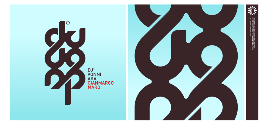
logo done for dj vonni.
designed for vertical business cards - that's the reason of otherwise bit unpleasant vertical flow. the "logotype" itself isn't really ment to be read, I went rather for an abstract symbol.
the whole card design will be submited when it's all done and printed.
designed for vertical business cards - that's the reason of otherwise bit unpleasant vertical flow. the "logotype" itself isn't really ment to be read, I went rather for an abstract symbol.
the whole card design will be submited when it's all done and printed.
Image size
900x421px 77.2 KB
© 2008 - 2024 Raven30412
Comments74
Join the community to add your comment. Already a deviant? Log In