ShopDreamUp AI ArtDreamUp
Deviation Actions


Description
I'm working on many projects at the moment, so after a little break, many new uploads are comming. This is the first one.
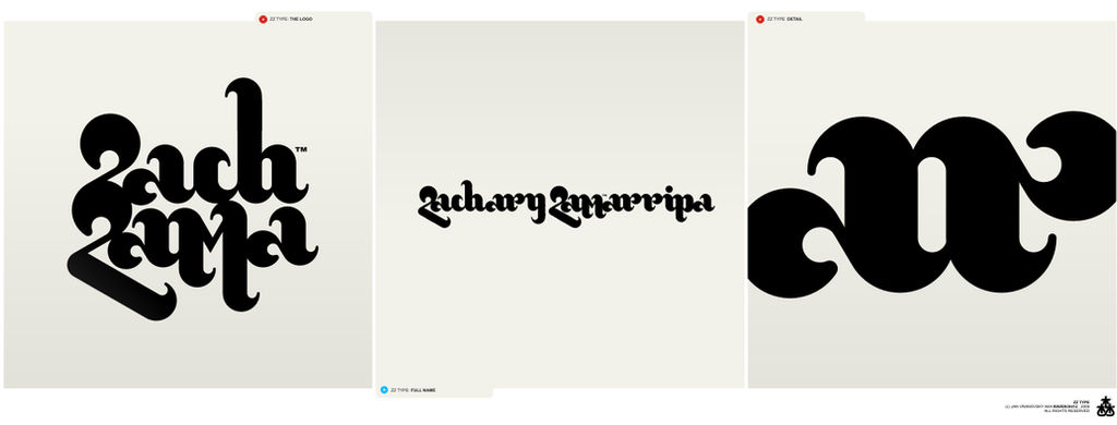
It's not-really-finished logotype / type concept I've created for a client. He rejected this version though. Since I think it's kind of interesting type treatment, and cos I'd really like to finish it, I'm offering it as a base of new logotype, for half the price I usually ask for.
So, if you like it and want it as your own logotype, note me and I'll gladly re-design and finish it for you.
Image size
1316x500px 57.89 KB
© 2009 - 2024 Raven30412
Comments66
Join the community to add your comment. Already a deviant? Log In
Nice style. I want it!